
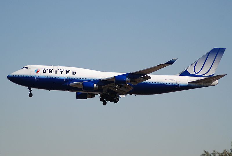
United Airlines B747-400, pic courtesy Aero Icarus via wikimedia commons
For the past few weeks I’ve had United Airlines on my mind. I’ve actually had United on my mind for quite some time now. I’ve worked for different airlines, airline brands, and codeshare partners over a 25 year (and counting) period. To say that I have a passion for aviation would be an understatement. My aviation career crossed paths with United back in the mid ‘80s when I worked as a part-time customer service representative at PBI. These were the heydays of United – the purchase of Pan Am’s Pacific Division, the only airline flying to all 50 US States, and in the late 80s a stock price valued at over $250. This was also a time of great turmoil at United which included a 29-day pilot strike. Overall, United was on cloud nine, and still flying the friendly skies. So, you can see why I’ve had United on my mind and why I have a soft place in my heart for the “tulip”. Recently I visited Chicago, and while at ORD, I couldn’t help but wax poetic as I walked around. While there I only saw 2 “tulips”, both on regional jets.
With the merger of United and Continental (a “merger of equals”) in 2010, the “tulip” began to disappear and was replaced by the Continental “globe”, albeit the name UNITED was chosen to adorn the aircraft. This “Frankenstein” branding was met with swift disapproval from many in the world of branding/marketing and vehemently discussed by many in the avgeek world.
Some would argue that the name United was mud in the aviation industry and that Continental was the “better” of the two airlines, so the newly merged company should have been named Continental. In the end, United understood that their name still held clout in the world and decided to keep the name.
So, here are 6 Reasons Why The “Tulip” should make a triumphant return:
1. Heritage – The “tulip” was introduced in the early 70s by graphic designer and Academy Awarding winning filmmaker Saul Bass. The “tulip” is a combination of the “U” in United and the shield logo which United had used since the 1930s. For many the “tulip” IS United.
The “tulip”
If shown the “U” I do believe most people (avgeeks for sure) would be able to identify it as United. If shown the globe I believe a greater number of people would say “Continental” than would say “United”. In addition, United has done a not-so-complete, or quick, job of replacing the “tulip” with the globe. You can still catch glimpses on regional aircraft and some marketing materials. In contrast, when Delta merged with Northwest in 2008, the goal was “out with the old, in with the new”. Delta sent out teams of people to identify, remove, and standardize all elements of the brand. As a result Delta’s brand image quickly became consistent across their route system including marketing and promotional items.
2. Something for employees to connect with – If I were to show you this image what would be your initial thoughts?

Image by “Almaden” at aviation-designs.net
If the slogan for this company were “We Love To Fly And It Shows” would you find it confusing? Not quite hitting the mark? Mismatched? More importantly, if you were an employee of said company, how would you feel? Would you be able to connect?
As a former employee of an airline that saw a few mergers, and a facilitator of customer service, I truly believe if employees do not believe in the message of the company, it is difficult to delivery any promise of great customer service. For any company to deliver consistent, thoughtful, and extraordinary customer service, the people delivering the service must believe the message. If the message is disjointed, confusing, doesn’t add up, this is exactly what will be delivered to the customer. United’s employee need something to rally behind. A message of “merger of equals” and “Frankenstein branding” keeps employees in their “silos”. sUA (subsidiary United) and sCO (subsidiary Continental) employees still have “their airline”. It’s something for them to hold on to. Some may hold on so long that they never move towards working together. This in turn will play out in the customer service that is delivered day in and day out. Contrast this with American Airlines. Approximately 1 month prior to the merger with USAirways in 2013, American decided to change its livery and chose a new look, feel, and livery. Part of me thinks this was by design – new livery, new leadership, new direction, and the upcoming merger with USAirways. Doug Parker (the incoming leader of the merged companies) said of the new livery “maybe we need to do something slightly different than that …The only reason this is an issue now is because they just did it right in the middle, which kind of makes it confusing, so that gives us an opportunity, actually, to decide if we are going to do something different because we have so many airplanes to paint”. Ultimately the employees decided on what the tail of the aircraft would look like (classic AA or “party tail”). By choosing a new livery for the combined company, silos are in effect removed and as a group EVERYONE can move forward in a new direction. It can be difficult letting go of the past. Time will tell how this course of action will play out.
It is my opinion, that having one unified brand will go a long way in helping United employees reconnect with their company.
3. Retro is in – If you haven’t noticed, what’s old is new again. The popularity of retro liveries is a great way of embracing the past. USAirways has done the best job in the industry embracing the family of airlines that are its heritage. And Doug Parker of American has publicly stated that the retro jets will remain in the new American fleet; even introducing a TWA livery in the future. Tapping into nostalgia has a way of unifying groups of people who have a common goal. Seeing the “tulip” evokes in me a time when United was on top of the world. For some, the “tulip” evokes the opposite feeling. As mentioned in the opening, the name United was decided upon as the name of the combined company. If the name United was indeed so bad/so toxic/detrimental, the powers that be would not have moved to keep the name in place. So, to keep the name and not the element associated with the name is confusing from a branding perspective. If seeing the “tulip” evokes such a negative feeling amongst some people, updating or stylizing the “tulip” to be more modern would have been a viable option. If you keep the name, keep the visuals as well.
I recently read that United with keep the retro Continental livery on their B737-900. This is awesome and a step in the right direction.

4. Mismatched branding doesn’t work – After the merger between United and Continental was announced there were plenty of articles written and many discussions on social media on how ineffective this type of branding can be. I can honestly say that whenever I see a United aircraft now, I don’t think United, I think Continental. I know I’m not the only one with this sentiment. When seeing the current United aircraft there’s a sense that something is “just not right” about it. It misses the mark. United article #1, United article #2, United article #3.

Now many of you may think “the traveling public really doesn’t care what’s on the outside of the aircraft” and with that I would agree. Again, it goes back to the people, the employees who deliver the customer service around the message of the company. If there’s a disconnect with how employees feel, there will be a disconnect with how they deliver the service. CE Woolman, the founder of Delta Air Lines is quoted as saying “An employee’s devotion to his or her company, dedication to the job and consideration for the customer determine a company’s reputation.” So, if the employees don’t feel quite right about the message, how can they deliver the customer service needed to take the company to the next level?
For employees, losing “your” airline brand or identity is a tough thing. As a former airline person with over 25 years in the industry, I know this feeling all too well. Back in 2006 when Song Airlines was folded back into Delta, it was extremely difficult. Especially difficult because we had proven that the little airline with 48 Boeing 757s could make a huge difference in the passenger experience. Many lessons were learned and carried back to Delta. Many of the lessons, work rules, on-board amenities, and service delivery procedures make up the new Delta. With this I’ve learned that things change (especially in aviation), that lessons are learned, that if you open your eyes wide enough you will see the fruits of your labor. This holds true for any of the mergers that have taken place. There’s always something that’s brought into the new company. If you slow down for a moment, take a good look, you’ll see elements of “your” airline even it it doesn’t physically exist anymore.
5. Rhapsody in Blue – Ahhh, that iconic 1924 musical masterpiece from George Gershwin. United first used this music in its advertising in the mid 80s. The following commercial is believed to be the first incorporating this music (click here). And then there are all of the whimsical artsy commercials which utilized the music as well. I’m sure you’d agree, each time you hear this piece you immediately think of United. Imagine my delight when in 2013 United reintroduced this timeless classic to its commercials. The piece is galvanizing, soaring, aspirational in its tone. As I mentioned I was in Chicago recently and went through the Tunnel connecting terminals at ORD. There is something magical about the all that neon, the colors, the moving sidewalk, and Rhapsody in Blue playing in the background. Rhapsody in Blue IS United.

Tunnel at ORD
6. Fly the Friendly skies – United resurrected “Fly the Friendly Skies” campaign in September of 2013. Long a favourite of employees and the traveling public, the return of this slogan came about as United begin to focus more on the passenger experience in its advertising and marketing. “‘Flyer-friendly’ resonated in feedback from our customers and co-workers,” Tom O’Toole, United’s senior vice president of marketing and loyalty and president of MileagePlus is quoted as saying. Most of United’s current marketing, including TV commercials, now uses the “flyer friendly” tagline.
On twitter and Facebook you will see the AirlineGuys using the hashtag #longlivethetulip. We use it to remind United and our followers of the legacy that is UNITED; not to forget or to bury those elements which brought you to this place and time.
Let’s think about this for a moment. Currently at United we have the UNITED name, Rhapsody in Blue, and Fly the Friendly Skies tagline. It seems as though all the elements are falling into place for a triumphant return of the “tulip”.
#longlivethetulip
Sylvester
